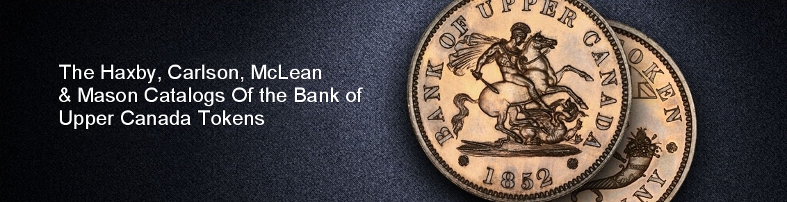
Bank Of Upper Canada 1850 Penny
BUC-225
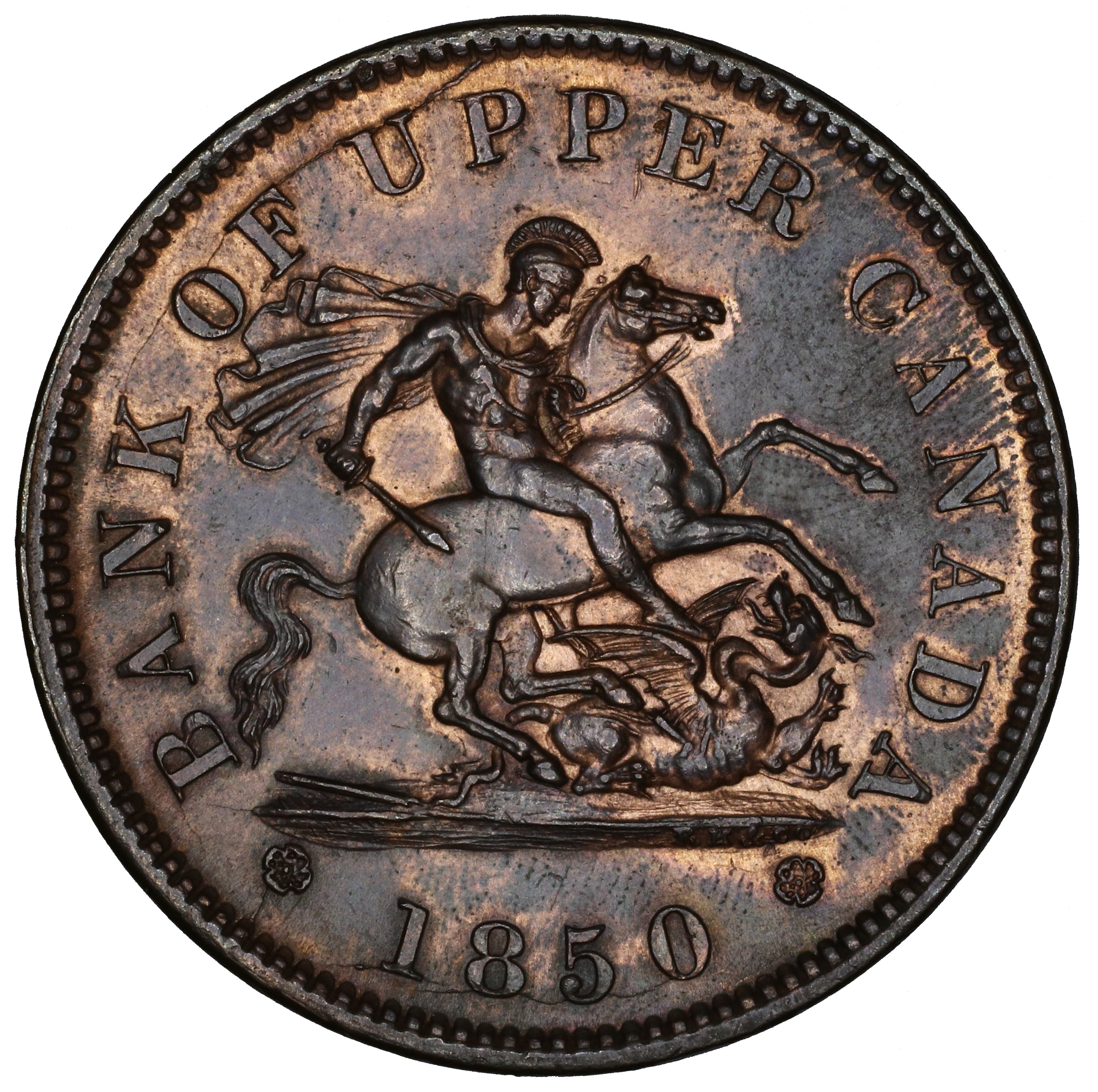
Courteau R6
B. Die Pair-Specific Comments
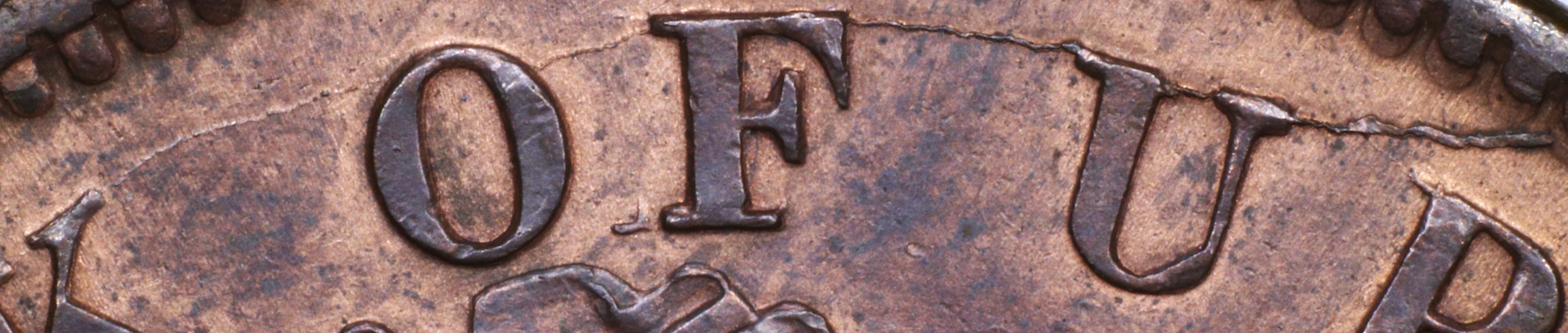
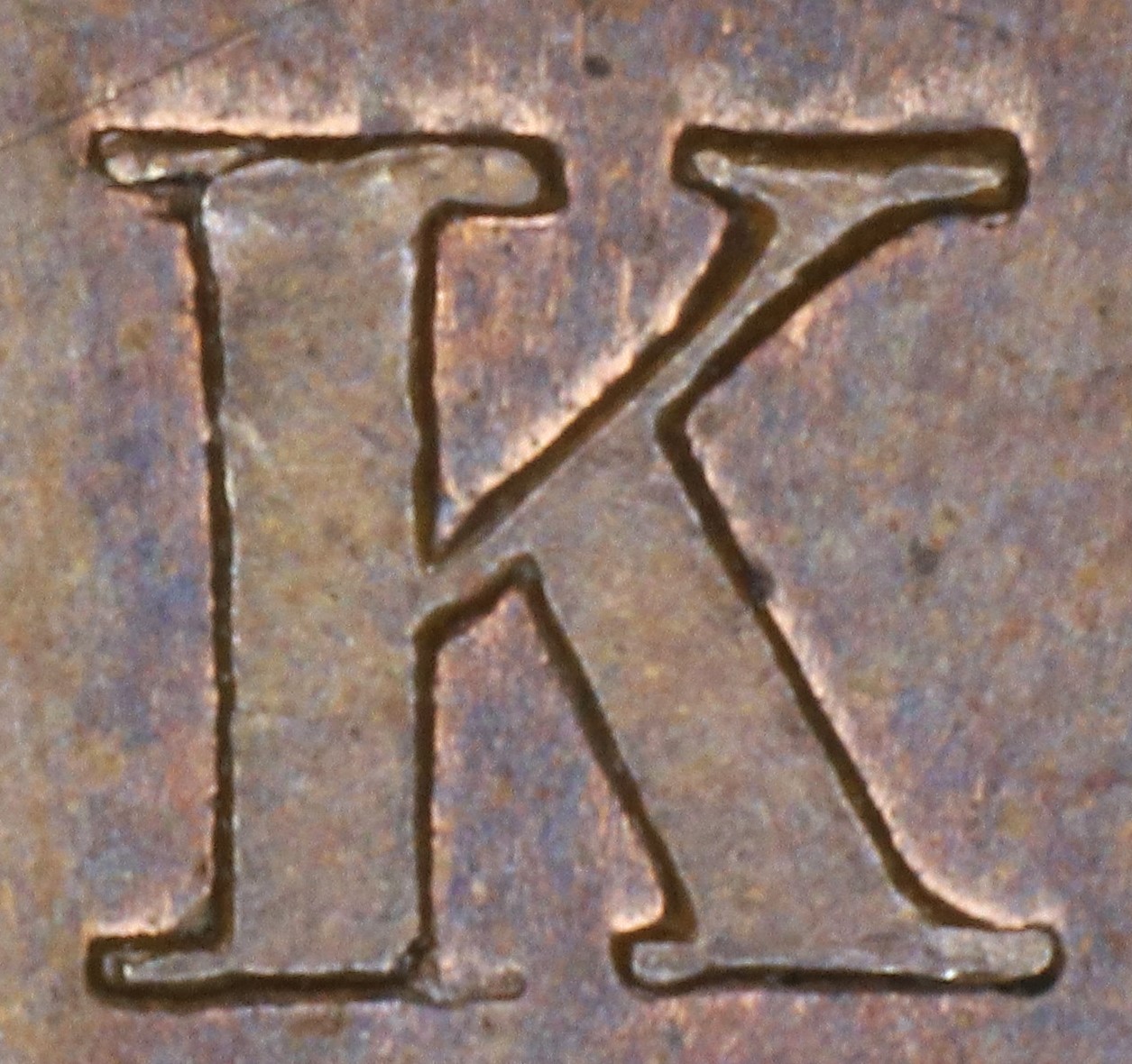
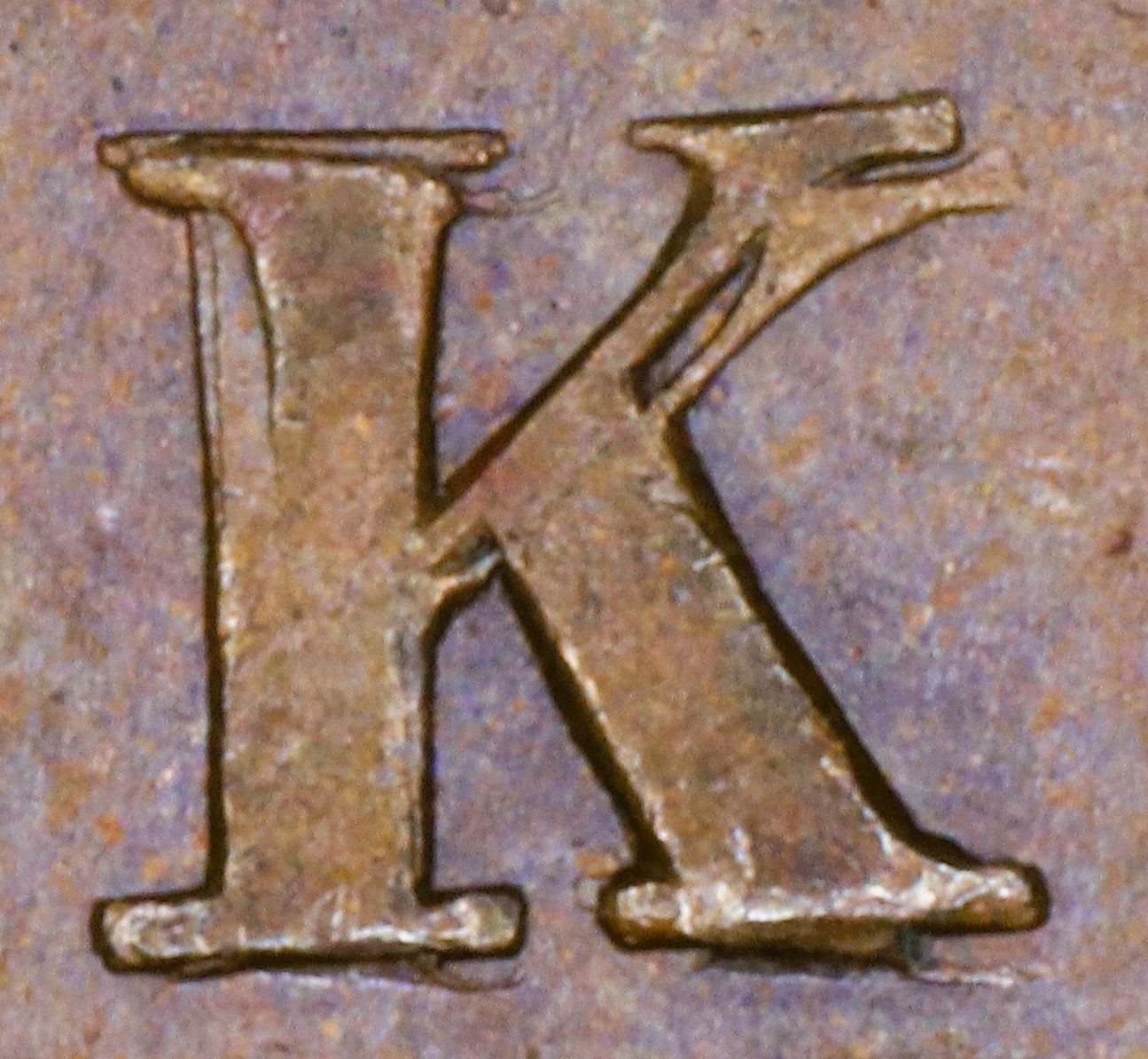
In BANK there is a major repunching of the K, which is die-defining for the die R214. This reverse has been found only on BUC-214 and BUC-224. This facilitates the rapid identification of both die pairs.
C. Obverse Die Details
1. Obverse O224 Die Cracks and Die State Progression
Summary: BANK OF UPPER CANADA * 1850 *
Red = area with die crack(s) observed in most advanced die pair state
Die Pair State Progression
Abbreviations: Cr = crack, T = trace, S = small, M = moderate, L = large
| Die Pair State | Obverse Characteristics |
| 225 | No Die Cracks |
| 225.1 | Cr OF UPPER (S), left rosette (T), edge to 1850, with sm. cud (T), edge to 1850 (T) |
| 225.3 | cracks: cr to 1850 extends to 8 (T), left rosette extends to left ground and to BANK, cr OF U (M); new cr UPPER (T), CANADA (T) |
BANK OF UPPER (state 225.3) |
UPPER (state 225.3) |
CANADA (state 225.3) |

Edge to rosette to ground tip to BANK (state 225.3) |
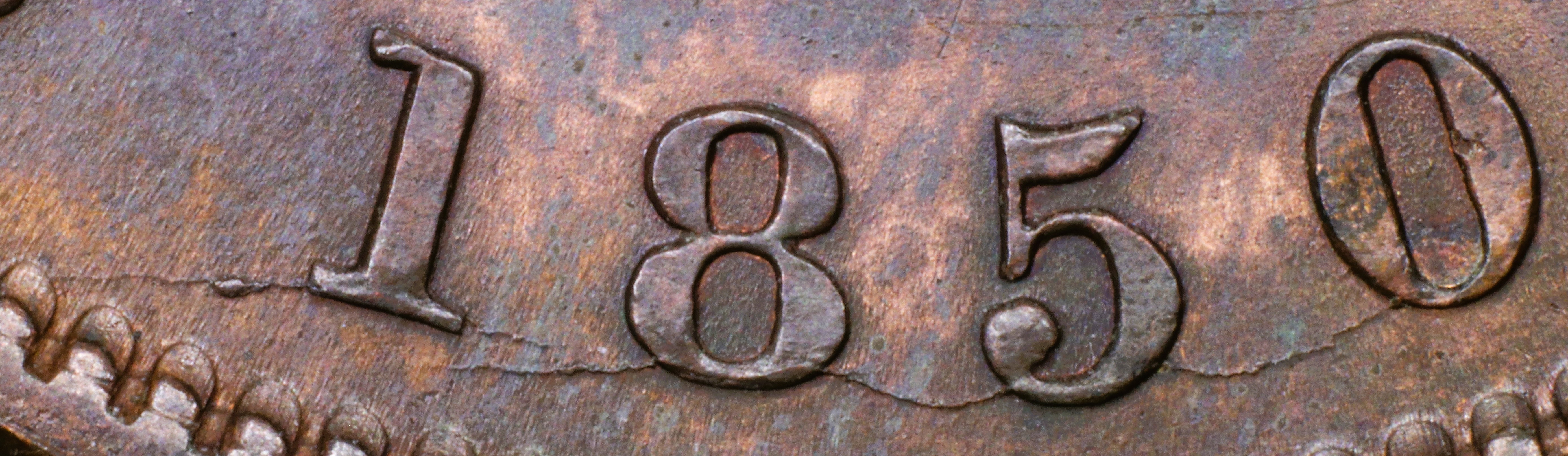
1850 (state 225.3) |
2. Obverse O224 Broken Letters Unrepaired or Repunched
Summary: BANK OF UPPER CANADA * 1850 *
Letter color code: Black = normal, Green = broken & unrepaired, Brown = broken with noteworthy repunching
BANK |
BANK |
BANK |
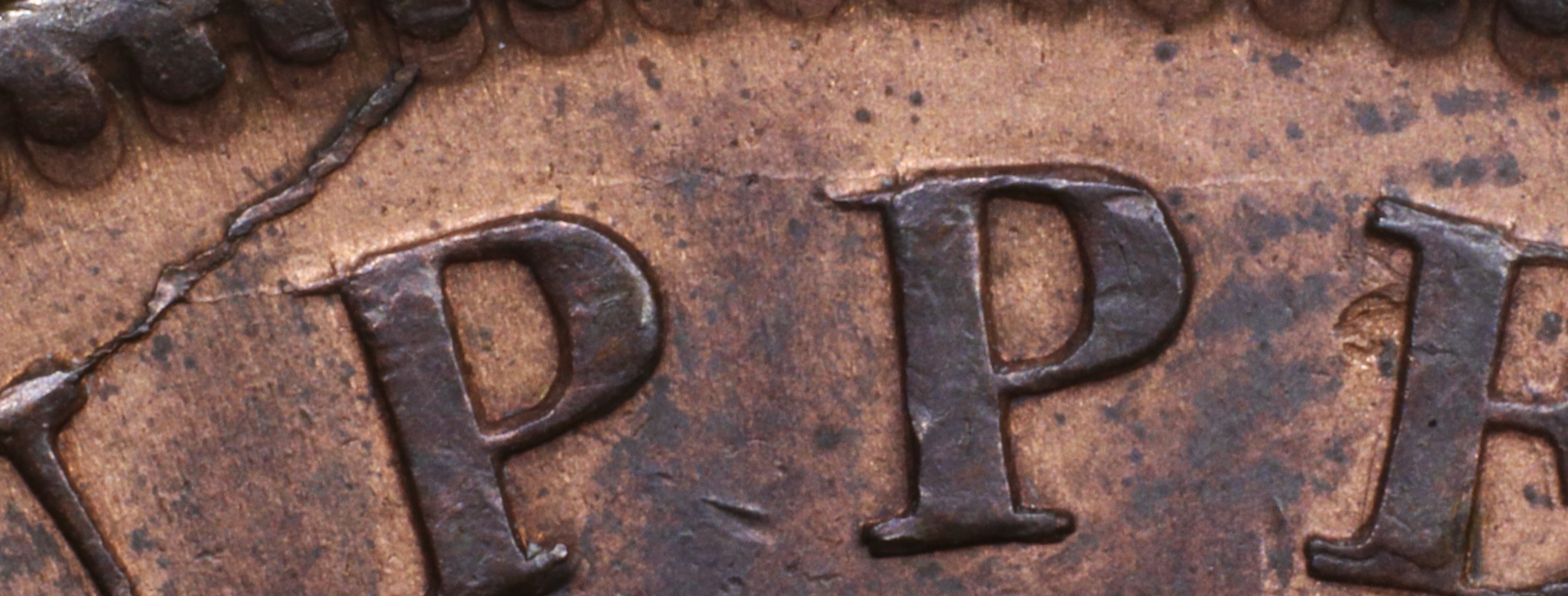
UPPER |
UPPER |
UPPER |
UPPER |
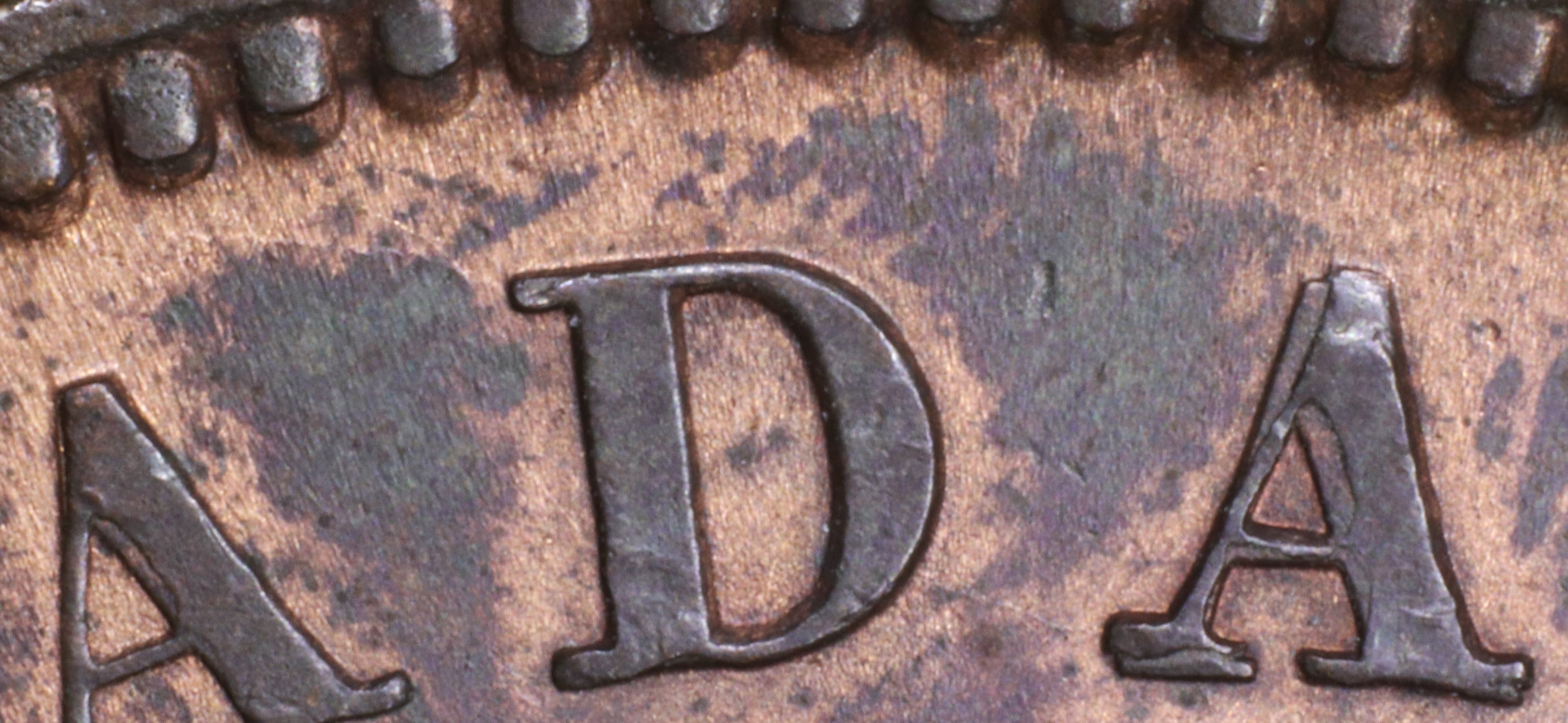
CANADA |
CANADA |
CANADA |
CANADA |
CANADA |
Special Comments:
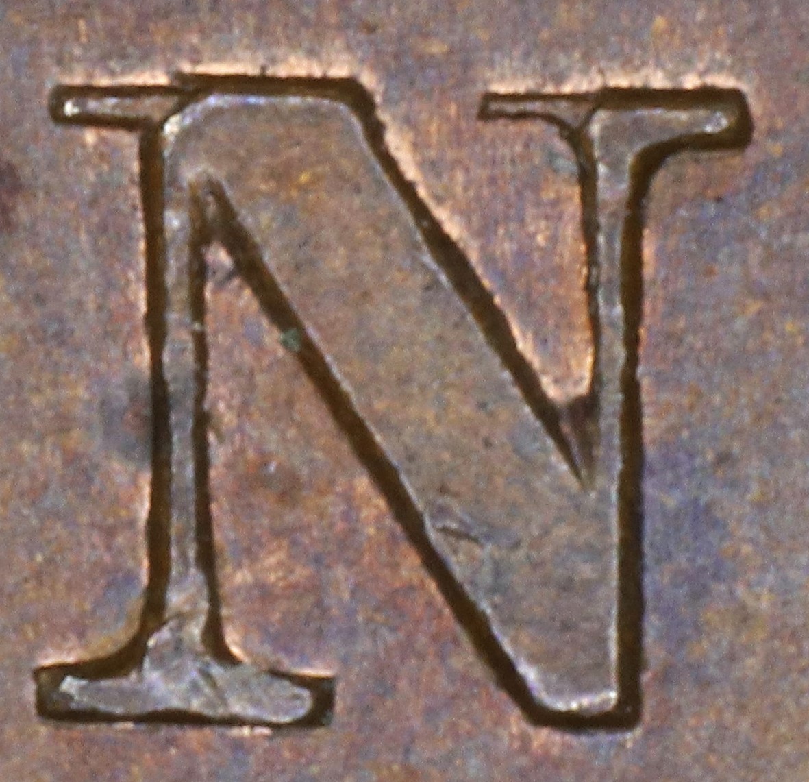
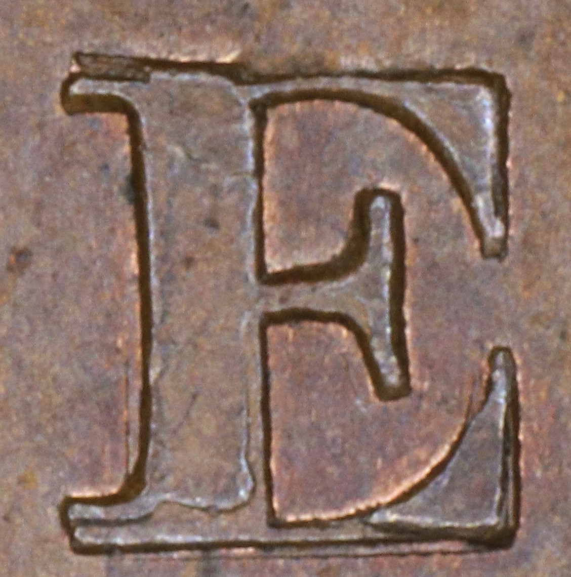
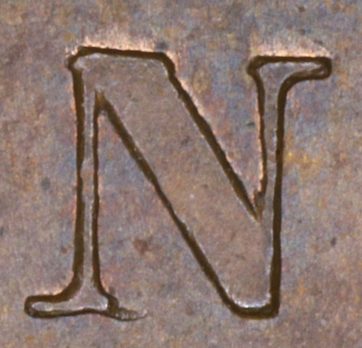
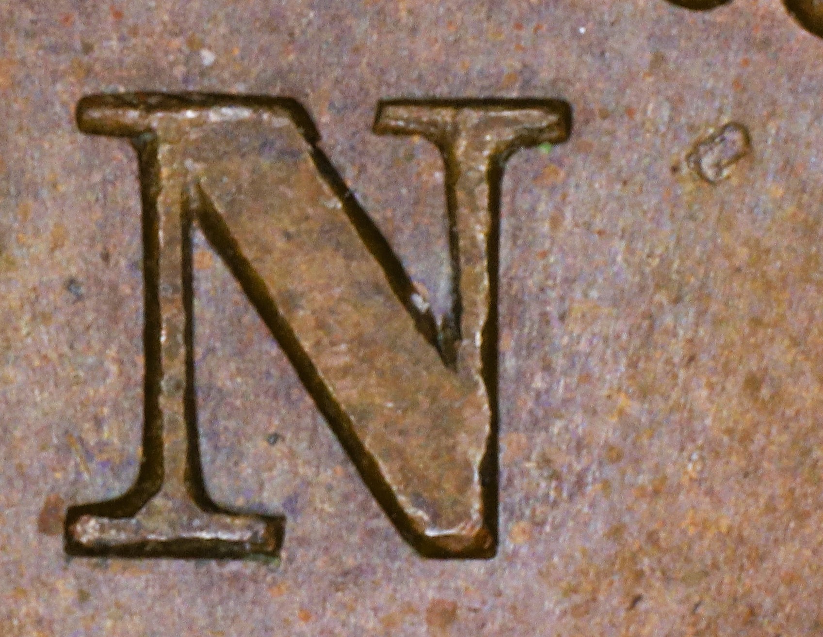
In BANK the N is repunched in lower relief in a new font with thin serifs. The upper left serif and left top of the right leg of the new font show where these features were missing in the original font.
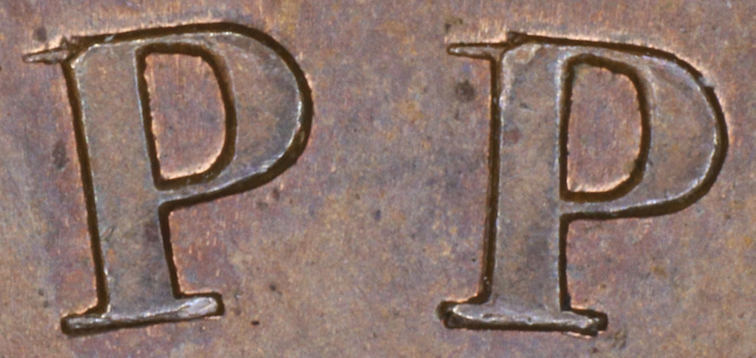
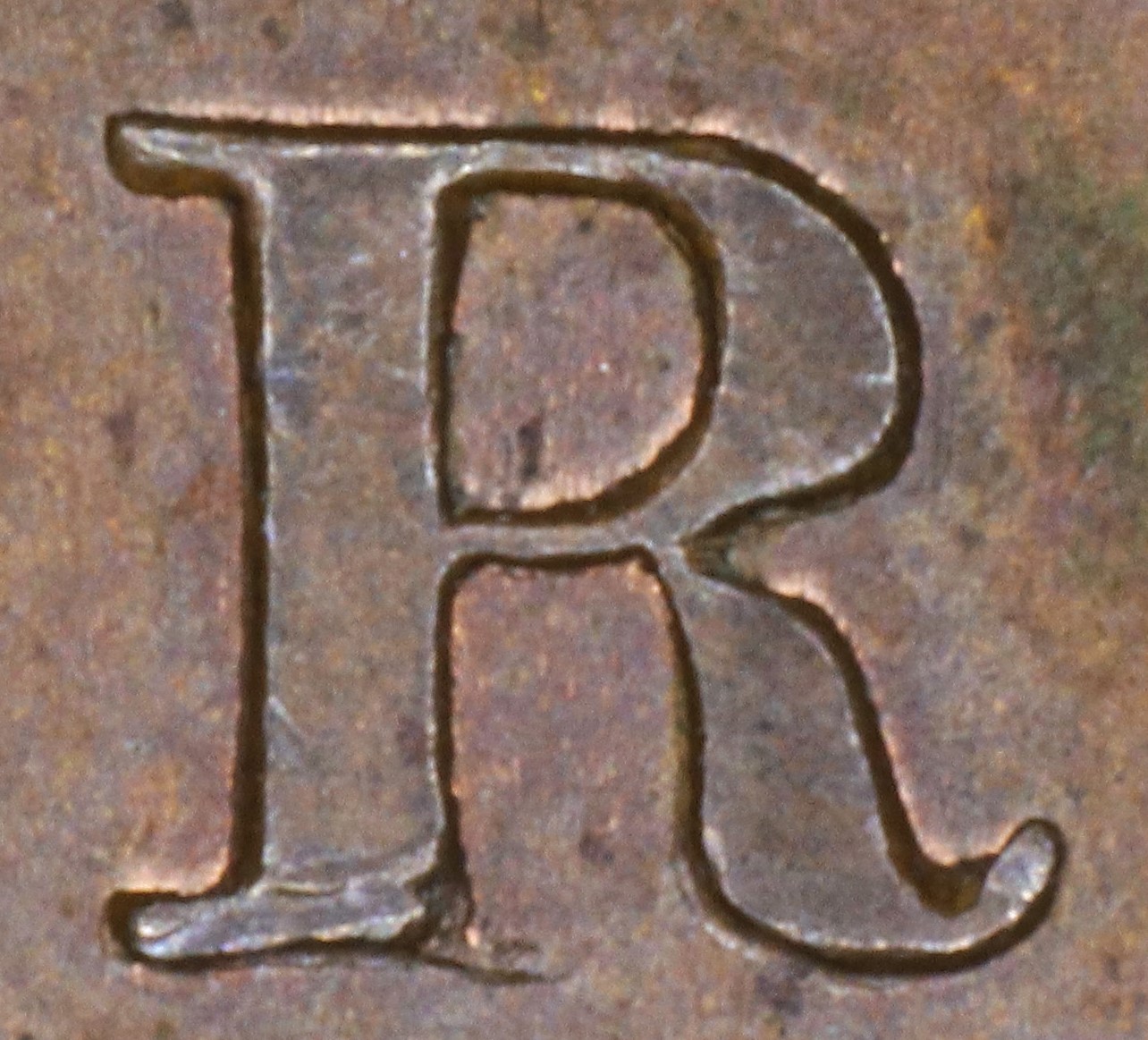
In UPPER the Ps are repunched in slightly lower relief in a new font slightly tapering upper left serifs (in the original font they were parallel). The serifs of the new font show because they had broken off the original.
In UPPER the E is repunched in lower relief, leaving the upper left serif doubled and showing the ragged bottom of the original upright and broken lower crossbar.
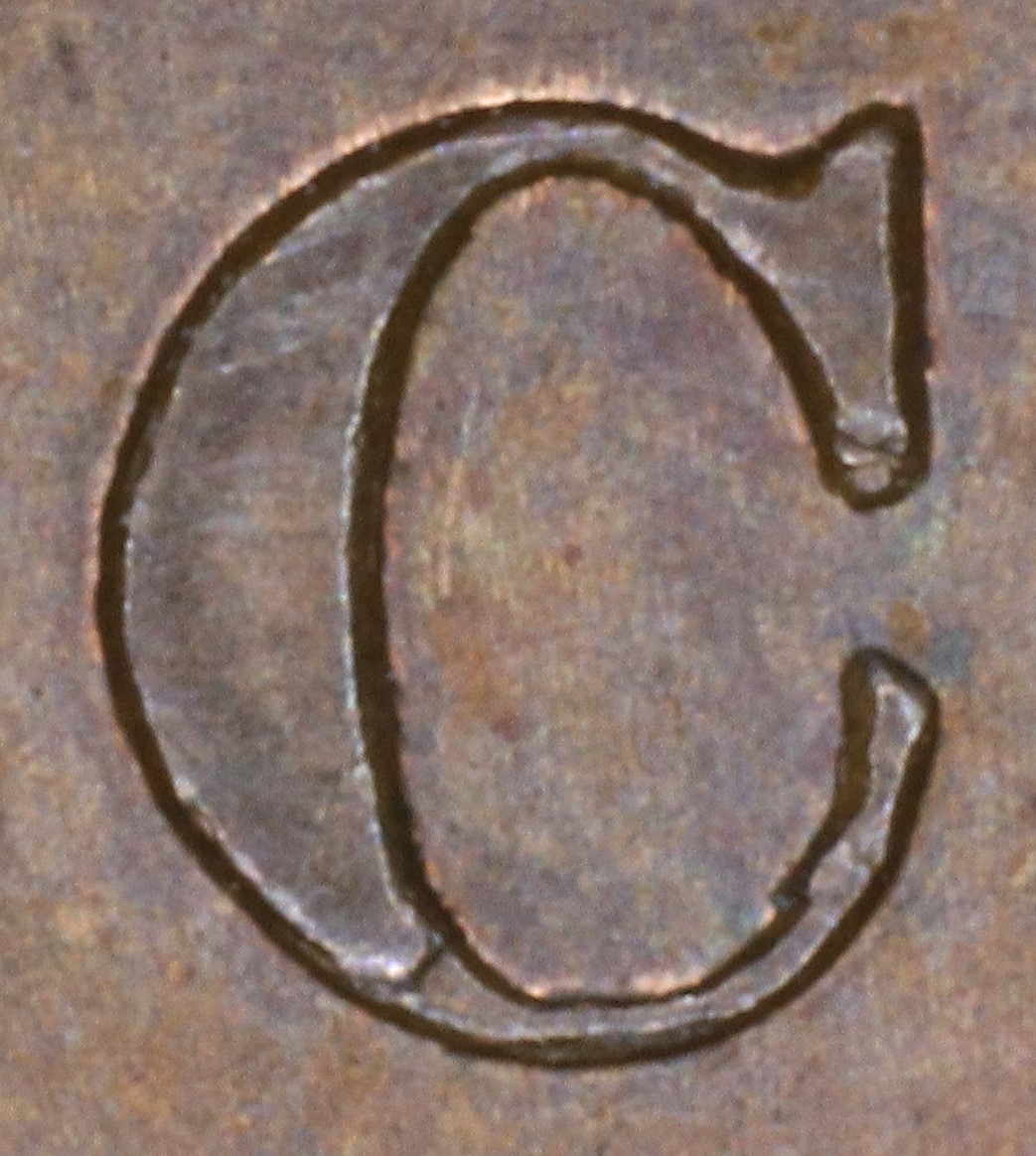
In CANADA the C is repunched in lower relief, leaving the breaks in the bottom curve of the original letter showing.
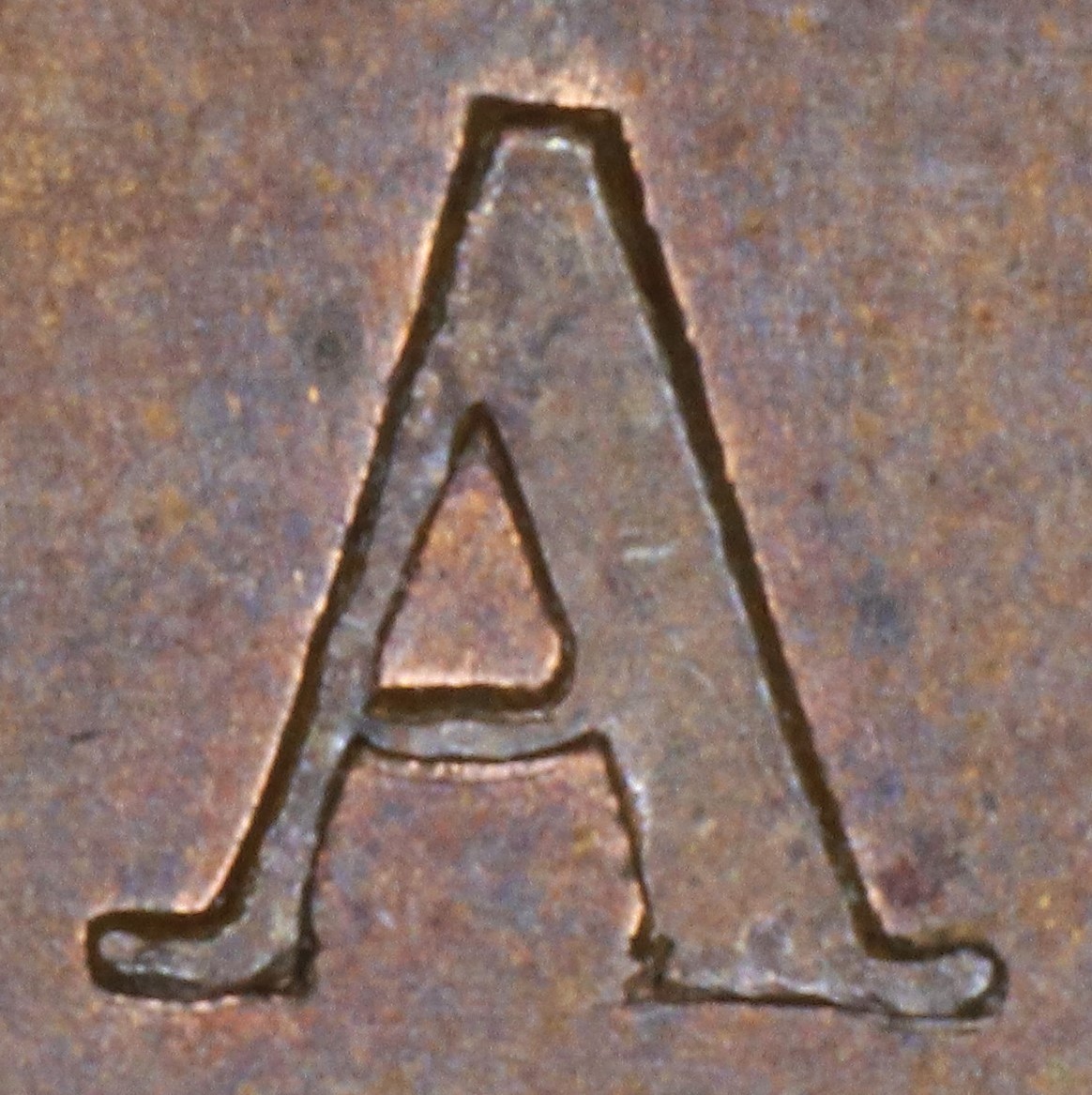
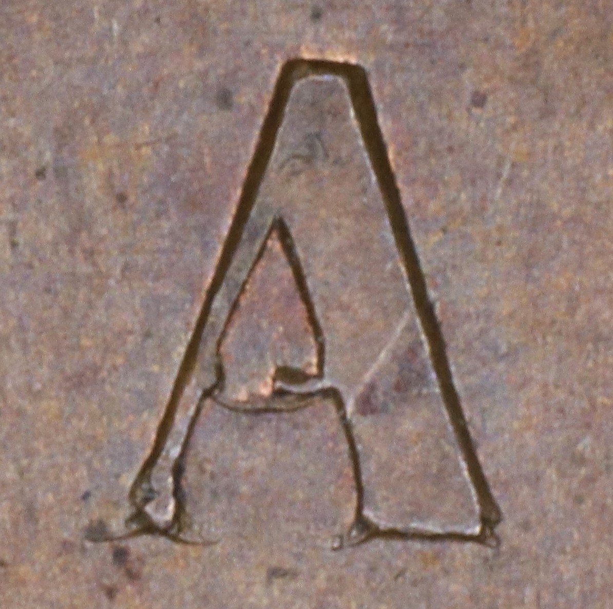
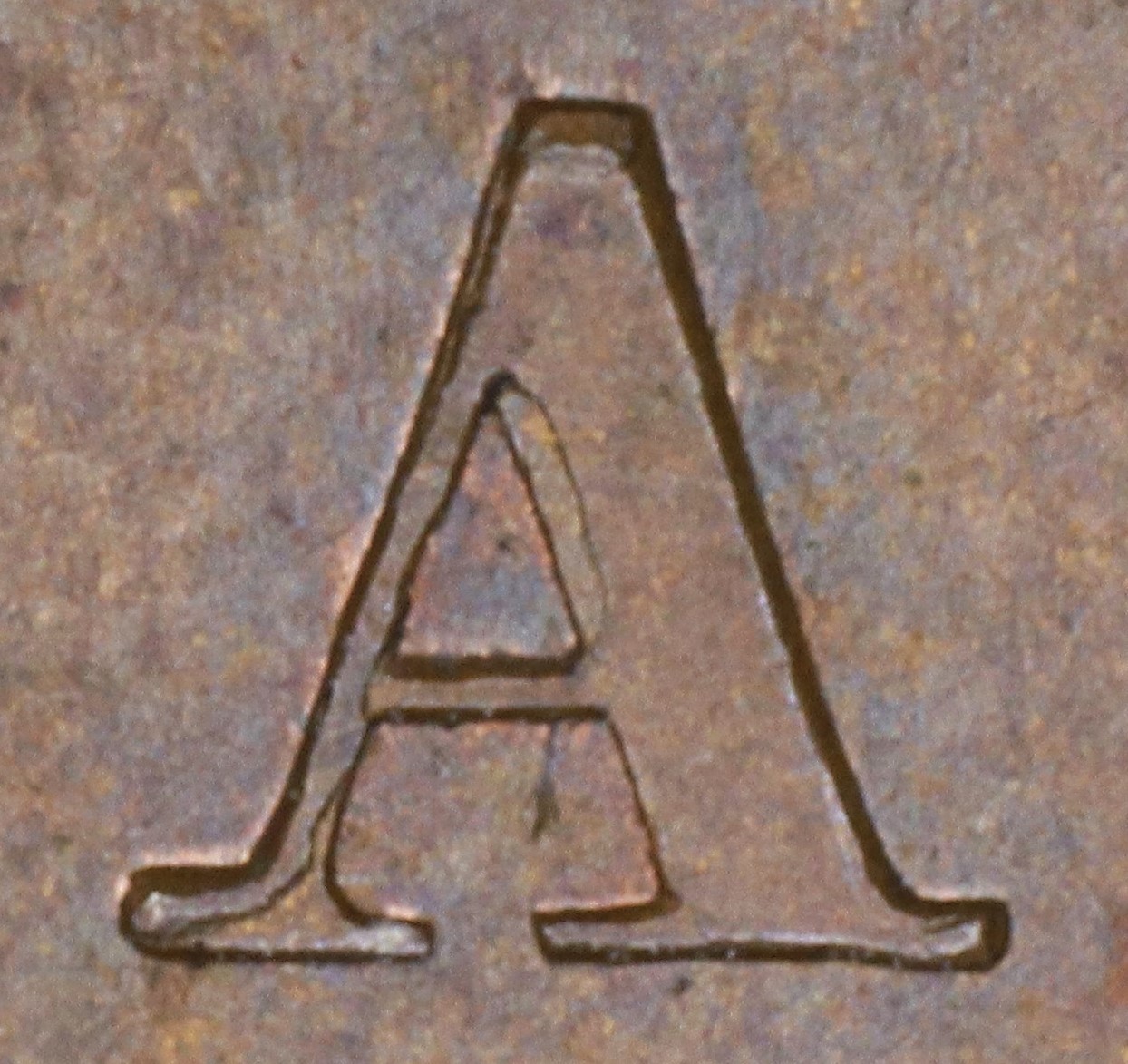
In CANADA the A is repunched in lower relief over the original faulty letter. Because of the difference in relief one sees major doubling at the right upright side in the central triangle and the remnant of the original foot of the left leg.
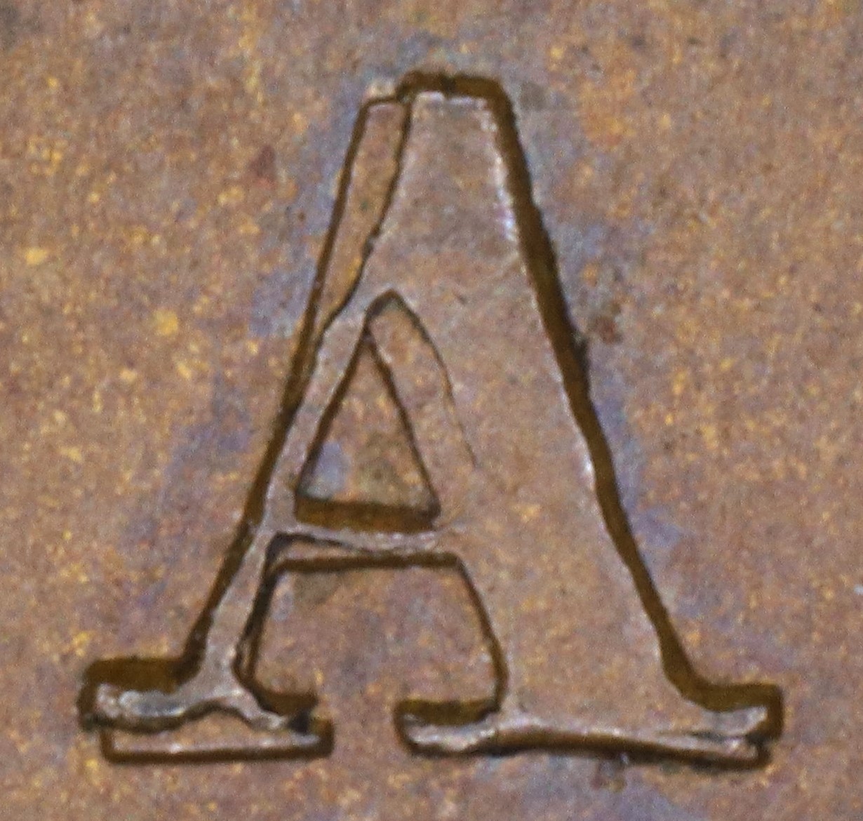
In CANADA the A has been repunched in lower relief over the original faulty letter. Because of the difference in relief the right upright side in the central triangle shows clear doubling and the broken bottom of the original foot of the left leg shows.
In CANADA the A has been repunched in low relief and slightly tilted compared to the original faulty letter. This causes doubling at the upper outside left of the left leg, at the left foot and along the right upright side in the central triangle.
3. Obverse O224 Die Clashes, Gouges, and Misc. Features
None noted.
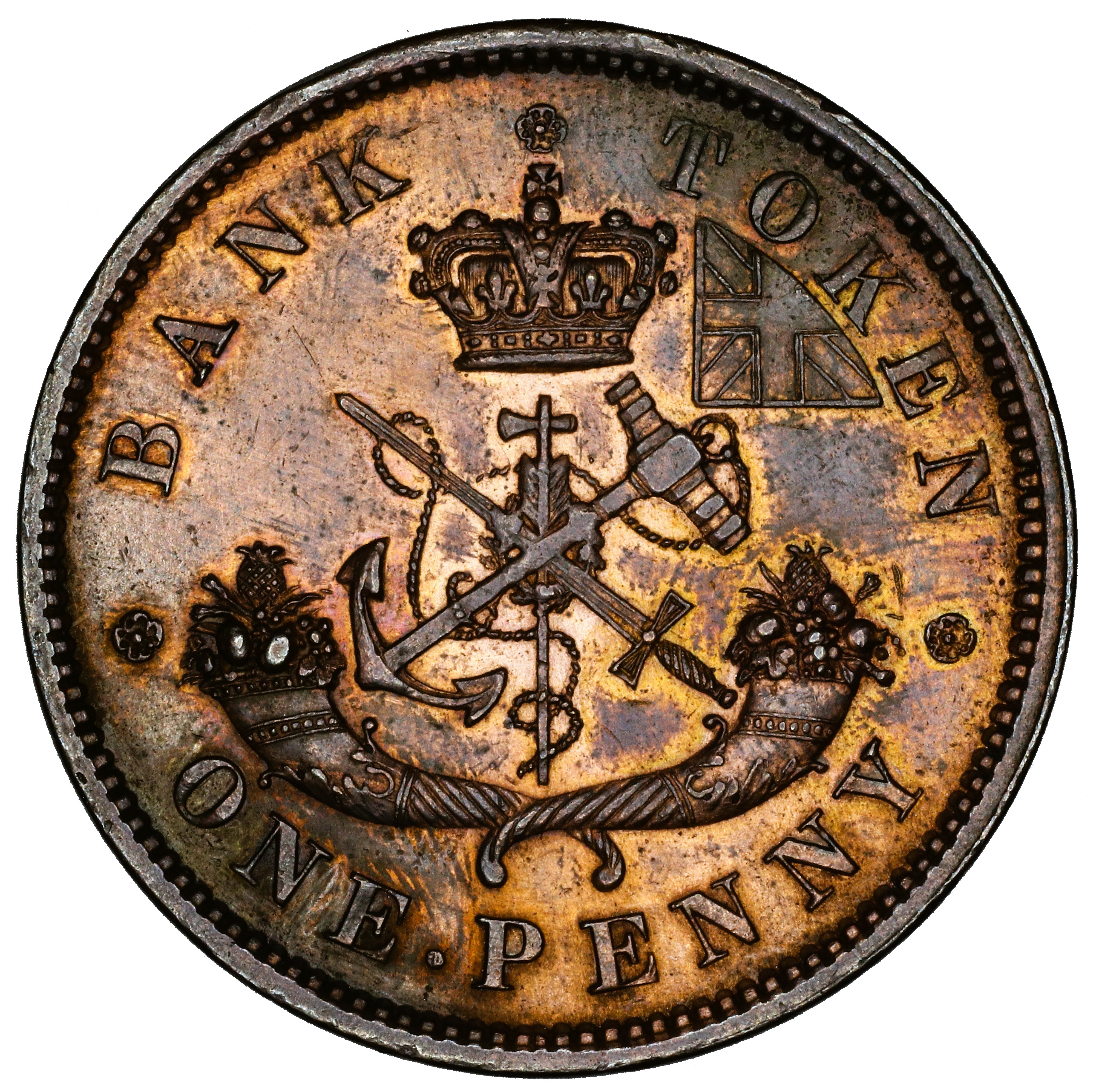
D. Reverse Die Details
1. Reverse R214 Die Cracks and Die State Progression
No die cracks noted. Die pair state progression only from obverse markers.
2. reverse R214 Broken Letters Unrepaired or Repunched
Summary: BANK TOKEN ONE PENNY
Letter color code: Black = normal, Green = broken & unrepaired, Brown = broken with noteworthy repunching
BANK |
BANK |
Special Comments:
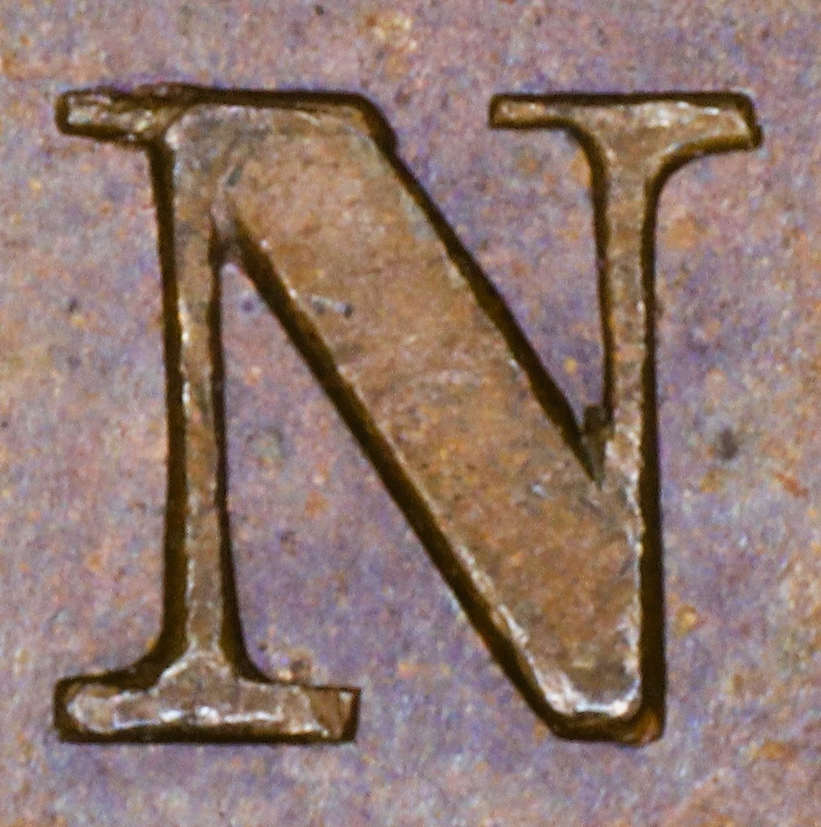
In BANK the N has been repunched with a new font with very thin serifs, one of which shows at the L top of the R leg where the original letter was broken.
In BANK the K is repunched at a slant, causing major doubling of the upright and arm.
3. Reverse R214 Die Clashes, Gouges, and Misc. Features
Rust mark near TOKEN |